
Chazie Baniquid
Technical Content Marketer
16 minutes to read
12 Simple Ways to Increase Form Conversion Rate
Getting visitors to complete an online form is often the key to generating leads, making sales, or growing your audience.
But let’s be honest—no one enjoys dealing with forms that are too long, confusing, or frustrating. The solution? Knowing how to increase form conversion rate by simplifying the process and enhancing the user experience.
With a few strategic tweaks, you can create user-friendly forms that encourage more submissions and boost conversions. Here are 12 effective tips to help you do just that.
1. Keep Forms Simple and Concise
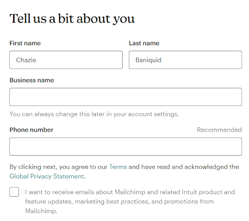
One of the biggest barriers to form completion is form fatigue.
If your form looks too long or complicated, users are likely to abandon it before they even start. That’s why it’s crucial to keep your forms simple and only ask for the essentials.
To avoid this, keep your form short and to the point. Consider what information is absolutely essential for your business. For example, an eCommerce store might only need a name, email, and shipping address, while a subscription service might require an email and password.
Here’s how you can simplify your forms:
- Focus only on must-have fields. If you don’t need their phone number or date of birth, leave it out.
- Use drop-down menus, checkboxes, or radio buttons instead of open text fields when possible. These options reduce the effort required from users.
- For complex forms, use conditional logic to show additional fields only when necessary, keeping the rest of the form uncluttered.
However, it’s important to not only focus on making forms simple but also to keep them secure. Using spam protection tools to prevent bot sign-ups is key to ensuring that only genuine leads come through your forms.
2. Optimize for Mobile Users
It’s estimated that over 55% of global web traffic comes from mobile devices, making it essential to optimize your forms for mobile use. However, mobile users are twice as likely to abandon a form compared to desktop users.
Why? Because many forms aren’t designed with mobile users in mind.
To ensure mobile users don’t bounce, your forms should be easy to navigate on smaller screens. Think about how users will interact with the form.
Are the fields easy to tap? Is the font legible? Is the form cluttered?
Mobile optimization tips:
- Ensure fields are large enough to tap easily. Small fields can cause frustration, leading to abandonment.
- Use auto-fill options wherever possible to speed up form completion.
- Place CTAs and important buttons where they’re easy to reach with a thumb (typically at the bottom of the screen).
- Reduce scrolling by keeping the form concise and using a responsive design that adapts to various screen sizes.
Pro Tip: Make sure to test your forms across different devices, including both Android and iOS platforms, to ensure they perform well on all screen sizes.
3. Use Clear and Persuasive Calls-to-Action (CTA)
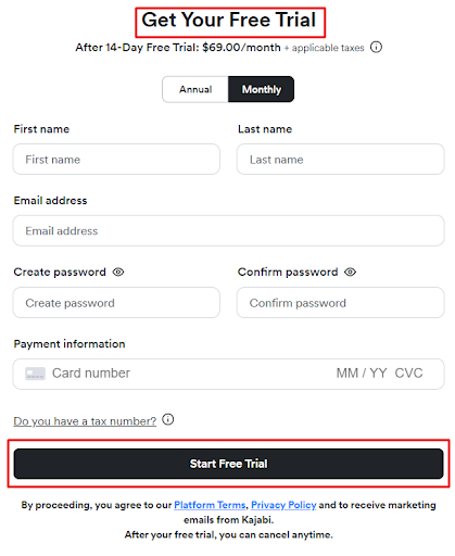
Your call-to-action (CTA) is the final step that turns a form submission into a conversion. However, generic CTAs like “Submit” or “Click Here” are missed opportunities.
Personalized CTAs can increase conversion rates by 202%. Your CTA should be action-oriented and focus on what the user gets in return for completing the form.
The more value-driven and specific your CTA, the more likely users are to engage.
Effective CTA ideas:
- “Start Your Free Trial” – Great for SaaS businesses offering trial periods.
- “Get My Free Quote” – Works well for services that provide personalized estimates.
- “Join Our Community” – Ideal for membership or newsletter sign-ups.
- “Download My Free Guide” – Attracts users looking for free, valuable resources.
Each CTA should clearly convey what happens next, building excitement for the user. For example, a CTA like “Download Now” immediately tells the user they’ll receive a downloadable asset after completing the form.
4. Avoid Too Many CAPTCHAs
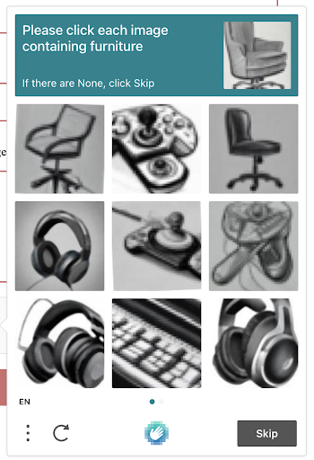
CAPTCHAs can help block spam, but they often frustrate real users.
You’ve probably experienced it yourself—struggling to read distorted letters or trying to figure out which images contain a crosswalk.
Not fun, right? This extra step can actually reduce form completions because it slows down the process and adds friction.
For some people, especially those with accessibility challenges or using a mobile device, CAPTCHAs can be even harder to solve. Plus, bots are getting smarter, which makes some types of CAPTCHAs less effective anyway.
By reducing the reliance on CAPTCHAs, you can provide a smoother, more user-friendly form experience that keeps conversion rates high while still effectively protecting against spam.
5. Implement Seamless Spam Protection
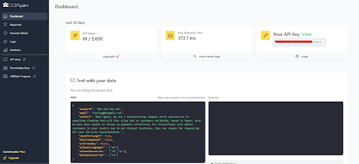
Spam protection is essential for maintaining the integrity of your forms, but it doesn’t have to come at the expense of user experience.
Traditional methods like CAPTCHAs or complicated verification steps can discourage users from completing your form. Instead, opt for non-intrusive spam protection methods that work in the background without impacting the user journey.
Why non-intrusive spam protection is important:
- It keeps your form user-friendly, minimizing any friction for real users.
- It silently blocks spam and bot submissions, ensuring you only receive genuine leads.
- It improves conversion rates by reducing form abandonment caused by intrusive security measures.
At OOPSpam (that’s us 👋), we make sure your forms are protected from spam without annoying your users.
Our spam filter works quietly in the background, so visitors don’t have to deal with extra steps or challenges. It’s all about keeping things smooth and easy!
By focusing on non-intrusive spam protection, you maintain that perfect balance—your forms stay secure and still feel user-friendly, helping you convert visitors without hassle. It’s seamless, safe, and effective.
6. Ensure Fast Load Times
Speed matters. A study by Google revealed that 53% of mobile users will abandon a website if it takes more than three seconds to load. Your form should load quickly and without any hiccups to keep users engaged.
Slow-loading forms frustrate users and give them plenty of time to reconsider their decision to submit. Ensuring your form loads quickly can directly impact conversion rates.
How to improve form load times:
- Compress images: Large images slow down page load times. Use compression tools to reduce file sizes without sacrificing quality.
- Minimize JavaScript: Excessive scripts can slow down your form’s performance. Consider using asynchronous loading for non-essential scripts.
- Use a CDN: A Content Delivery Network (CDN) helps distribute your form assets globally, improving load times for users no matter where they are located.
Choosing the right hosting provider is also essential for speed. Popular shared hosting providers like GoDaddy or Bluehost can really slow things down. Managed hosting services like Cloudways or SiteGround offer much better performance and faster load times.
Also, using a caching service like Cloudflare helps by reducing server load and delivering content faster. And instead of using heavy solutions like reCAPTCHA, try a lighter, server-side option like OOPSpam to keep your forms fast and secure without slowing things down.
Regularly test your form’s speed using tools like Google PageSpeed Insights or GTmetrix to ensure optimal performance across devices.
7. Offer Incentives for Completing the Form
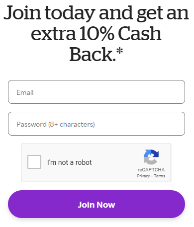
An excellent way to encourage users to complete your form is by offering something of value in return. Incentives give users a reason to submit their information, and they feel like they’re getting a reward for their effort.
Your incentive doesn’t have to be extravagant. It just needs to align with the needs of your audience. This could be a discount, a free resource, or entry into a contest.
Incentive ideas:
- Discount Codes: “Sign up and get 10% off your first order.”
- Exclusive Content: “Download our free eBook when you subscribe.”
- Giveaways: “Enter to win a free consultation.”
Make sure your incentive is clear and directly tied to completing the form. The promise of an immediate reward is a strong motivator that can significantly boost conversions.
8. A/B Test Your Forms
What works for one audience may not work for another. This is why A/B testing is crucial to understanding which form elements drive conversions and which don’t.
A/B testing allows you to create two or more variations of your form, testing different elements like CTAs, field placement, or even color schemes. By comparing performance, you can optimize your form based on data rather than assumptions.
Don’t forget to monitor results over time. Small tweaks can make a big difference, and continuous optimization through A/B testing ensures your form stays effective as your audience evolves.
9. Use Multi-Step Forms for Long Forms
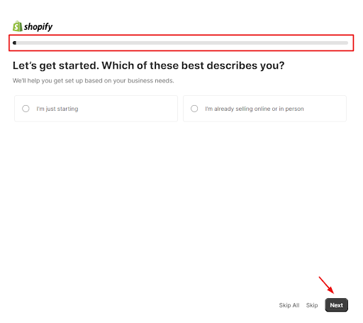
Long forms can overwhelm users and lead to high abandonment rates. However, breaking your form into multiple steps can make it feel more manageable. Instead of displaying all fields at once, a multi-step form breaks the process into digestible chunks.
For example, step one might ask for basic information (name and email), while step two covers shipping or payment details.
Multi-step form best practices:
- Segment the form logically: Divide fields into clear sections like “Personal Information,” “Shipping Address,” and “Payment Details.”
- Use progress bars: Show users how far they’ve come and how close they are to completing the form. This helps keep them motivated.
- Ask easy questions first: Start with simple questions to encourage users to continue. More complex fields (like payment info) can be saved for the final step.
By using multi-step forms, you create a more engaging and less intimidating experience that encourages users to complete each step.
10. Make the Form Accessible
Accessibility is essential for reaching a broader audience and ensuring that all users, including those with disabilities, can complete your form. By making your forms accessible, you not only improve conversion rates but also create an inclusive user experience.
Accessibility tips:
- Screen reader compatibility: Ensure your form fields are labeled correctly and can be navigated by screen readers.
- High contrast colors: Make sure there is enough contrast between text and background colors to improve readability for users with visual impairments.
- Alt text: Provide alternative text for any non-text elements, such as images or icons, to assist users who rely on screen readers.
Accessibility isn’t just good practice—it’s a legal requirement in many regions, including under the Americans with Disabilities Act (ADA). Prioritizing accessibility ensures that everyone can interact with your forms.
11. Use Real-Time Validation
There’s nothing more frustrating than submitting a form, only to discover errors that need to be corrected. Real-time validation solves this problem by providing instant feedback as users fill out the form, reducing errors and improving completion rates.
Benefits of real-time validation:
- Instant error detection: Users are notified immediately if they’ve made a mistake, reducing the likelihood of submission failure.
- Smoother experience: Real-time validation makes the process feel seamless, as users don’t have to go back and correct multiple errors after submission.
- Increased completion rates: With fewer errors, users are more likely to complete the form on the first try.
By incorporating real-time validation, you reduce friction and provide a smoother, more user-friendly experience.
12. Provide a Simple Thank You Page or Confirmation Message

After users submit your form, don’t leave them hanging.
A simple thank you page or confirmation message reassures users that their submission was successful and gives them a clear next step. This not only improves user experience but also opens the door for further engagement.
What to include in your thank you message:
- Confirmation of submission: Acknowledge that their form was received (e.g., “Thank you for your submission!”).
- Next steps: Let users know what to expect next (e.g., “We’ll get back to you within 24 hours”).
- Further engagement: Provide a CTA to keep users engaged, such as links to related content or an invitation to follow your social media channels.
Thank you pages are a simple but effective way to leave a positive impression and encourage users to stay connected with your brand.
Start Optimizing Your Forms Today
Learning how to increase form conversion rate is all about making the process smoother, faster, and more secure for users. By applying these 12 strategies, you’ll reduce friction, create a more engaging experience, and see improved results. Whether it’s simplifying your forms, optimizing for mobile, or testing different elements, these tips will help you understand what works best for your audience.
And as you optimize, don’t forget about security. Protect your forms from spam without adding extra steps for users. OOPSpam offers seamless spam protection, ensuring that your forms stay clean and secure while keeping the user experience simple.
So, which tip will you try first?